As my family prepares to welcome our second son into the world, I will be taking a hiatus from creating more complex artwork and blog-posting. In the meantime, please enjoy this awkward conversation I had recently with some grandparents at a local playground!
That’s right, folks. Today I bring you (cue the Monty Python voice) something completely different hot off Little Mr. 906–a.k.a. my newest studio addition, the etching press, which I have mentioned in prior posts.
This printing technique is what you might call a “twofer:” it marries the linoleum block print with a drypoint etch all in one single print. Needless to say, this technique (which I discovered and read up on Belinda Del Pesco’s amazing blog of experimental printmaking) called for a strong dose of planning, patience, time, paint-mixing, and many runs through the press. (Thank goodness for that press!)
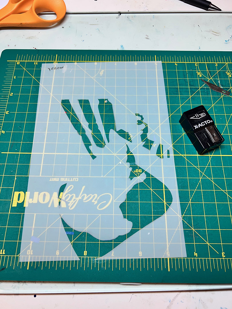
The first thing I needed to do was come up with a sketch and some idea for how many colors I dared–er–wanted to print. I transferred the sketch onto the linoleum and blocked in my chosen pigments with colored-pencil. I ended up using a total of five colors.
Everyone knows that hurdles are to be expected when trying out something new and somewhat complex. My first hurdle was dealing with the fact that you must always start with the lightest colors first when carving linoleum for a reduction print.
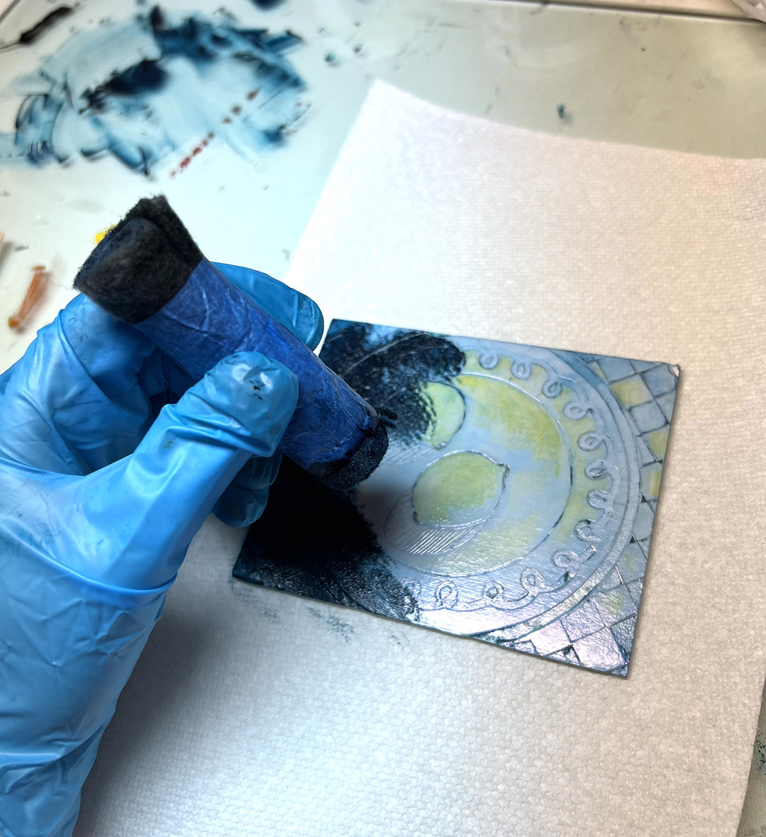
As you can see from the pictures above, I ended up needing to create a mask (I used plastic tracing paper) for the yellows, since there is a strong presence of blue in my image and I wanted to make sure the yellows stayed yellow while at the same time allowing some areas (in this case, the chair cushion) to turn into greens when I made the blue pass.
In the same vein, I didn’t want my blues ALL turning green, which would happen if I inked the entire linoleum plate in yellow for a first pass. Masking is great for solving issues like this.
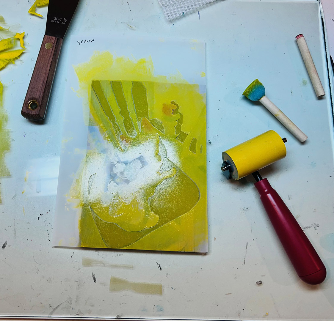
After masking, I added the pink details with a sponge pouncer.
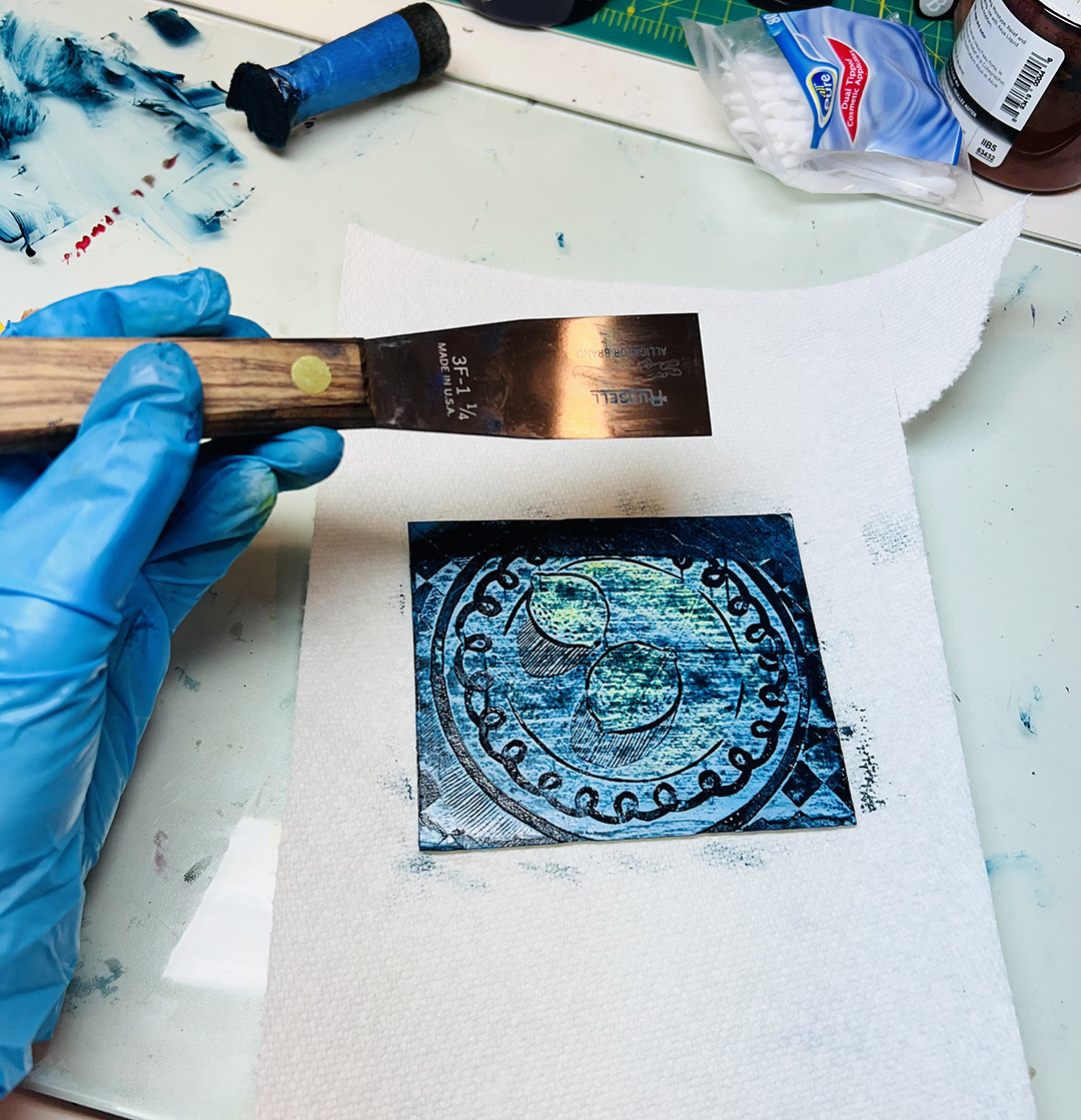
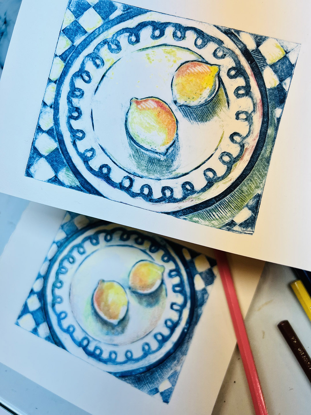
Here is the final color run for the linoleum print portion of this project: a dark bluish black. You can see that all of the prior colors have been completely carved away.The finished color prints! After each color was run through, I had to wipe the plate clean and proceed to carve out the areas for the next color. I let each color dry completely overnight to prevent any smudging or ink transferring issues.
I decided to make 10 prints total. Even though I cut 15 sheets initially, I was so tired from caring for my toddler in the daytime, I decided if fate had it that I managed to totally screw up all 10 prints in the end, I just needed to regroup and try something else entirely.
It turned out that fate was on my side! After five colors and five runs through the press, I ended up with 8 good prints, which is a pretty lucky start.
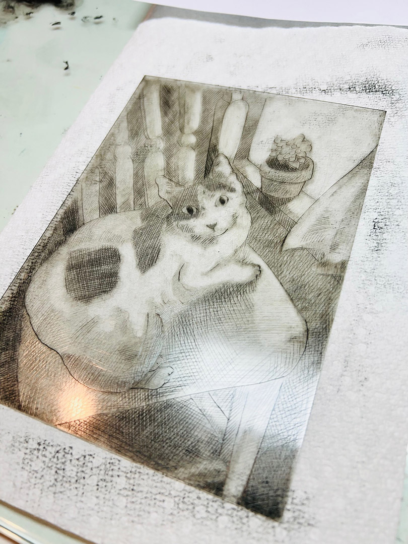
Once the linocuts were complete, the final step in the process was to ink up and run a plate of plexiglass I had carved, dry-point style, back over all of the good lino prints.
Yes, what you are thinking is correct: this is yet another chance to screw up prints! (This is why I made so many prints to gamble with initially.)
This leads me to my final hurdle: lining everything up correctly.
Despite my very best efforts, my first run was not aligned AT ALL. After beating my head against the wall one evening trying to find a solution, I decided to sleep on it. The next day, it finally occurred to me–duh–that plexiglass is clear: I could simply ink the plate, flip it over, carefully match it up to each print without fear of unintended ink transfer (remember how much pressure it takes to actually make a dry-point print?) lightly tape it down with painter’s tape, flip it back over, and run it through.
Bada-bing-bada-boom: worked like a charm.
So: there you have it folks: my first lino-drypoint mashup. Overall, I’m very happy with how it turned out.
Do I want to do more of these in the future?
My impatient and toddler-weary side of me would probably prefer something that gave me a little more instant gratification. This entire process has taken me weeks to complete since my free evenings are limited in quantity and time. However, that’s not what creating is about, is it? You can’t get better at something with a one-and-done. So the answer is yes, I will be making more, at some point.
Several months ago I became fascinated with the endless possibilities–of which I was previously unaware–that printmaking can afford an artist. I’m not sure what started me down this rabbit hole, perhaps it was my continued search for something other than watercolor to keep falling back on like a tired old habit, but it has turned out to be one of the best rabbit holes I could have stumbled upon. Countless articles and excellent blogs (with special thanks to Belinda Del Pesco’s blog, which is far superior, vastly more extensive than mine and a gold mine of a resource for a printing novice) have taught me just about as much as a crash course class in printmaking could.
So, with a heart full of gratitude to the internet, on to more printmaking adventures!
Long before getting my Little Mr. 906 I had been chomping at the bit like a frothing horse to try out collagraphy, which I had never heard of until I read about it.
What first got me interested in this technique was how basic it really is: no fancy carving tools, plates, acids, washes, or inks are needed to create these stunning little pieces that positively pop with color.
I won’t give detailed instructions for creating a collagraph–this isn’t a “how-to” type of blog and I don’t wish to make it into something that extensive–but I will give a quick low-down for those who are specifically interested in how the “La-La-Lemons” prints were made.
I first cut down some scrap mat board to make a plate and carved out a design with an x-acto into its uppermost surface.
I then sealed the block with clear varnish to prevent sticking, and let it dry.
After mixing up my desired color, I used a dauber (rolled up craft felt) to push the ink into the recessed areas of the plate. (Sound familiar to an etching? It is!)
After wiping the surface, leaving the ink in the recessed areas, I found that I had to go in with Q-tips to really scrub away at anything I didn’t want to be slightly tinted with a blue hue.
I added additional ink colors with a paintbrush until I was satisfied, and pushed her through the press!
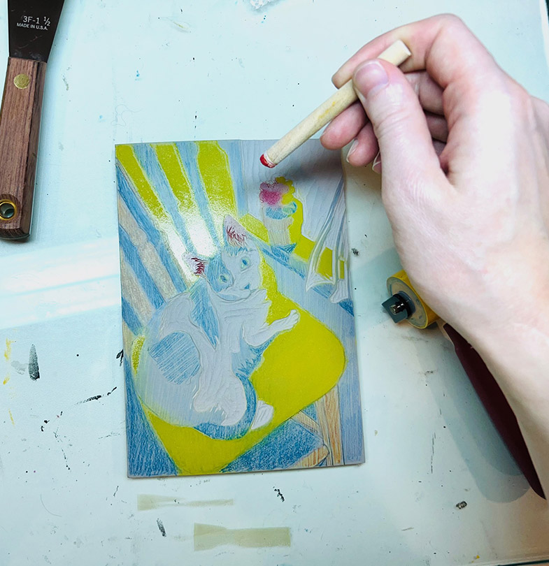
After I used up all of my mixed inks (and pulled three successful prints), I went on to use colored pencil to create a bit more interest and variation to each print, making every one completely unique!
*If this post has piqued your interest in collagraph printing, I do have a few things to consider that I discovered along the way:
First, this is another technique that cannot be achieved without the press. It seems there is disagreement on this point, but I can’t see how this can be done by hand without lots of frustration and aching wrists.
Second, it is vital to use a thickener for your background ink, or else it will just wipe off completely. I used Akua Intaglio Mag Mix.
Third, while you can get by with newspaper and Q-tips to lighten the raised areas on the plate, it seems to me that wiping tarlatan is a better investment than the headache that came with using newspaper. Tarlatan is cheap, and I’ll see if it makes a difference in my next print.
Finally, when cutting out your design, you don’t have to cut very deep…however. My shallower cuts definitely had some trouble holding ink, so I would say to cut a bit deeper than you would initially think.
Overall, I would say this experiment was a great success!
Back in July I promised a drypoint etching on this blog (thought I’d forgotten, eh?). Well, here it is! I promise, I deliver–even if the delivery comes 7 months later. But hey, this is why my readers have to faithfully keep checking in on my little blog. You never know what you might find next, amiright?
One of the reasons why this post was so long in the works was because after an initial failed attempt (and two sore wrists later) at doing a drypoint print sans printing press, I was simply fed up with how limited my printmaking sessions could be without an etching press to do the job.
I’ve been dabbling in various printmaking methods for years–mostly linoleum and woodblock prints, which are pretty forgiving when it comes to hand-pressing–but I have always ended up disgruntled from constantly being hobbled by the nature of the beast: hear me out! There are some printing techniques that are, in my opinion, unachievable without a press, especially if you want to save your wrists and your sanity (and since I’m a mother and I’ve already lost half of my sanity I would like to keep the rest of it, thank you very much!)
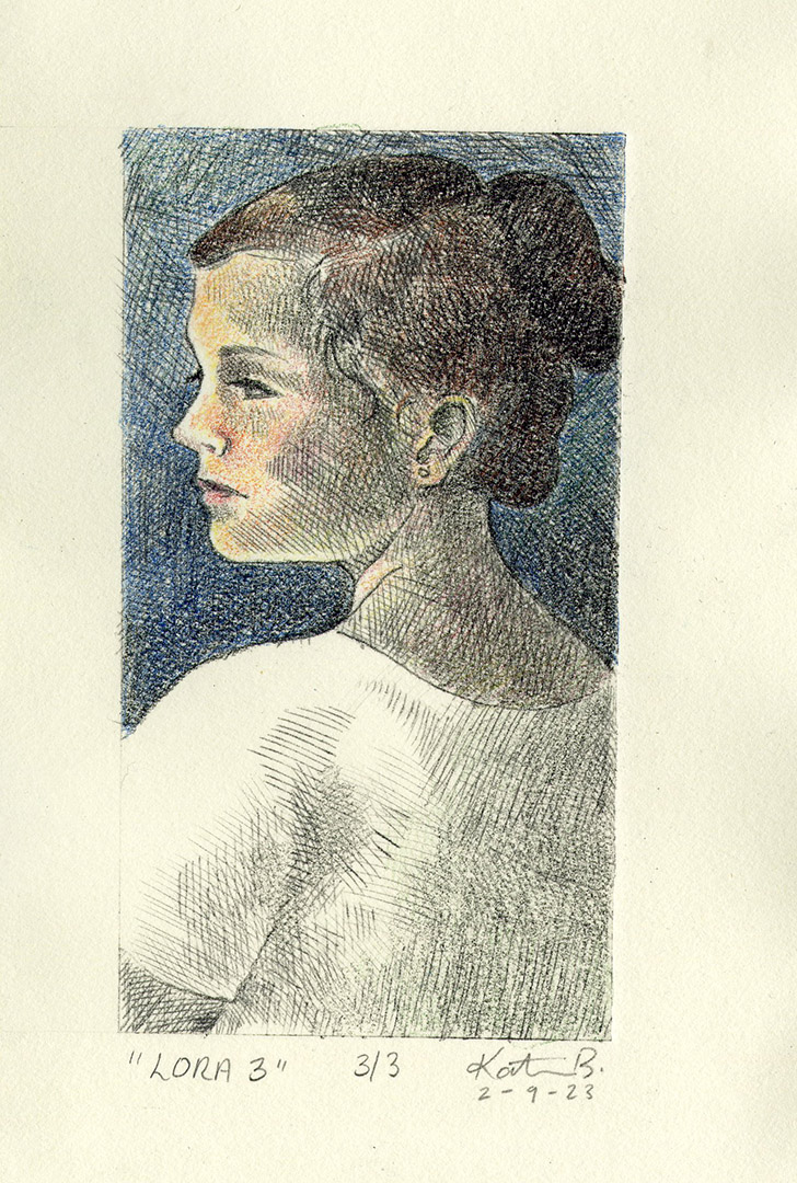
The finished sketch of “Lora”, ready to be engraved into plexiglass.
Pictured above are a few process shots from my first attempt to hand-press this etching. Even when using thin Japanese kozo paper, which works quite well for block prints, the print came out blotchy and uneven. Comparing the etching plate (left) to the final print (right), you can see how so much of the ink was still left on the plate, even after intense rubbing with the baron AND a metal spoon.
So, I bit the bullet and finally did what I’ve been wanting to do for years: I bought a small press from Blick.
Meet my new baby, Little Mr. 906.
Is it a Takach press? Only in my dreams. (Oh, how I lust after those presses!) But let me tell you, this little beauty has turned out to be quite the gem with a fairly inexpensive price tag. Last evening I tore some nice, thick Stonehenge paper, let it soak a bit, and ran three prints through the press and so far this bad boy does deliver. Behold!
I decided to tint the last one with some colored pencils after the print dried overnight because, why not? The worst I could do was screw up a print, and obviously I can now make many more without the fear of sore wrists hanging over my head.
I think I’ve definitely fallen head over heels for that little blue press. I cannot wait to do more printing! As always, stay tuned.
Before you have kids, you think to yourself about how your kid would never whine, scream, freak out, or shout–I’m here to tell you that anything can and will happen with a toddler, including a simultaneous obsession and fear over cows. Yep, he still loves his little toy farm set cows, even after this incident!
I think he’ll stick with the smaller, plastic kind of bovine for now…
And thus ends the months-long Chicken Saga comic! Thanks so much for staying tuned through thick, thin, and the holiday season. Although this tale has been a bit embellished (ok…maybe quite embellished), the story is real: One day I got a weird note from a neighbor in my mailbox claiming they had one of our chickens in the yard! Since we had no missing chickens, I was convinced they were hallucinating, or at least mistaking an unnaturally large mourning dove for a chicken in their bushes.
Sure enough, it was indeed a runaway chicken, they did indeed name her Dolly and yes, I did make Malcolm go and grab her after his work and classes in the middle of the night!
We were a bit unsure of how Dolly would fare at first. (This is partly why this story took so long to illustrate–I didn’t know how things would turn out and I was pretty much making these comics up on the fly.) For a little while, she wasn’t really doing that well. She had clearly lost a lot of weight during her wanderings and was extremely stressed and losing so many feathers the chicken coop looked like a ripped pillowcase for several weeks. She refused to eat, we weren’t sure how much she was drinking (if at all) and she had an injured beak, to boot. She spent most days wedged up on a high roost we made for her.
Slowly but surely her hunger and curiosity got the best of her, and the rest of the flock took to her quite well, all things considered. There were a few pecking-order skirmishes, but nothing other than the usual fowl brawl that happens now and again.
Now, I am happy to say that Dolly has gained back her lost weight and re-grown her feathers, which are coming in silky, cream-white, and fluffy! Even better? She is actually laying beautiful blue-green eggs in the middle of winter!
We love our Dolly, and I am so glad you, dear reader, could take part in this saga with us.
Dolly the chicken, as of January 2023.Eggs in the winter! Woohoo!
I used to dislike New Years. Being such a Christmas fanatic, the New Years holiday seemed more like an anti-climactic ending to such a festive time of year–like Christmas’s sad, ugly, forgotten cousin who had a birthday that everyone felt they needed to begrudgingly acknowledge–than a real cause for celebration.
But, in the past several years, I have grown to increasingly love New Years because it is a holiday that is filled to the brim with hope. It’s the holiday of endless possibilities: you can sit down and list out all of the things you’d like to do or aspire to in the next year, no matter how wild the ideas are that cross your mind, AND you have 365 days to do all of those things! Not a week! Not a month! An entire year. There is no rush, no limits, and my daydreamer self loves that concept.
Here is to a happy, healthy New Year for everyone.